Public experience · Shipped 2025
The Digital Legacy
A life worth understanding.
A clear place to begin.
Designing a multilingual kiosk experience that introduces R.S. Gavai’s life to school students and visitors at his memorial in Amravati.
- My role
- Research, information architecture, UI/UX & branding
- Project
- deMasters team · 6 months
- Platform
- 8 offline kiosks · 32-inch displays
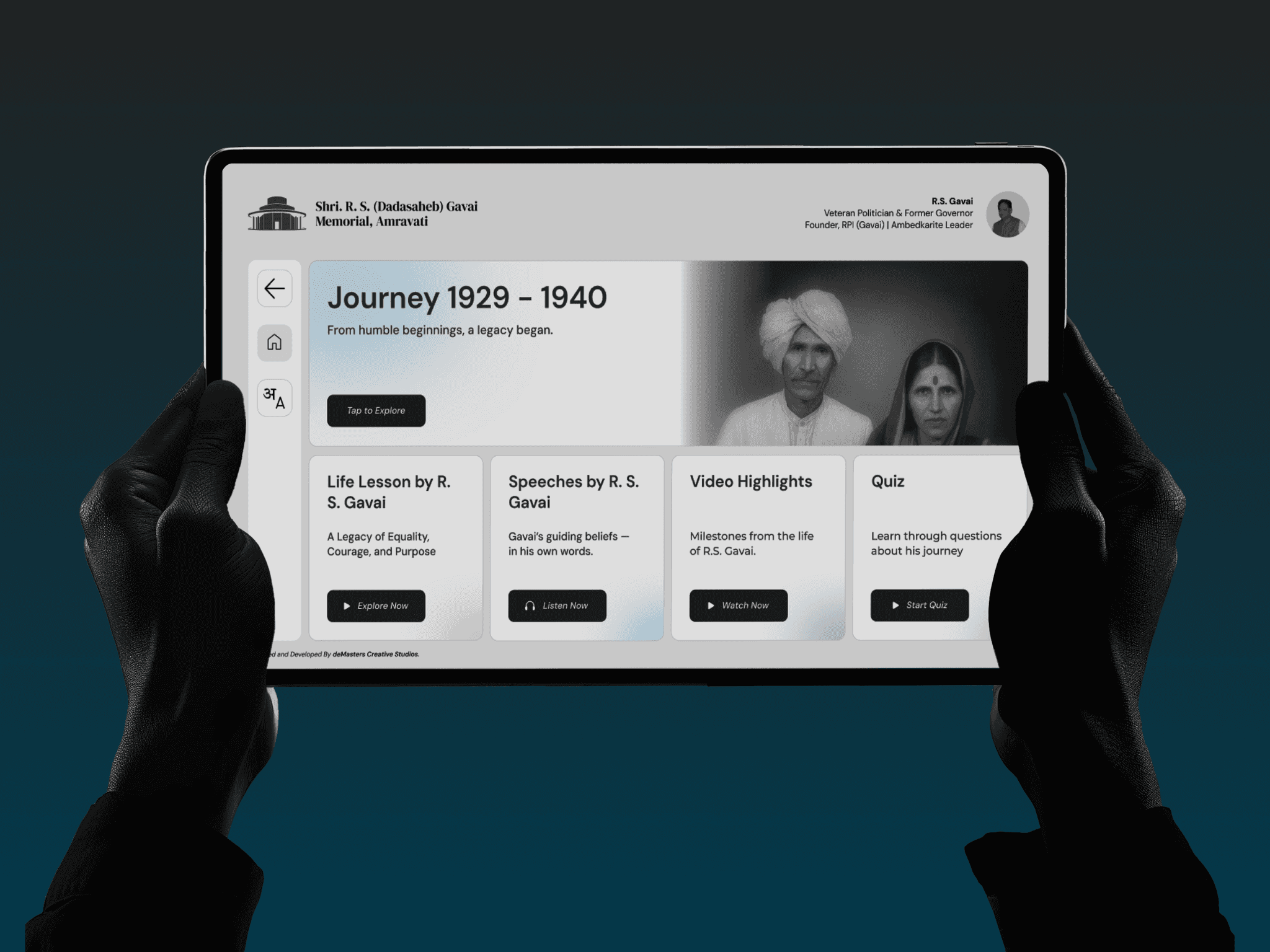
The brief
Turn a broad request to share R.S. Gavai’s legacy into an approachable experience, while preserving the accuracy of the history. Launched on 30 October 2025.
01
Context
A memorial for people discovering his story.
The Government of Maharashtra wanted a memorial that would introduce the life and work of the late R.S. Gavai to a wider audience, especially school students and people interested in history. Our team at deMasters Creative Studio was asked to help visitors understand that story through an interactive experience.
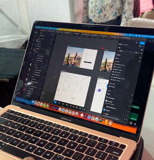
I joined at the beginning and worked across the project over roughly six months, from naming and visual identity to research, information architecture, user flows, interface design, and developer handoff. I worked alongside two other UI/UX team members and one developer, and remained involved through the launch.
The audience spanned young children to older adults. We planned for visitors around five to eighty years old, with different reading abilities and levels of comfort with technology. Marathi, Hindi, and English were part of the experience from the outset.
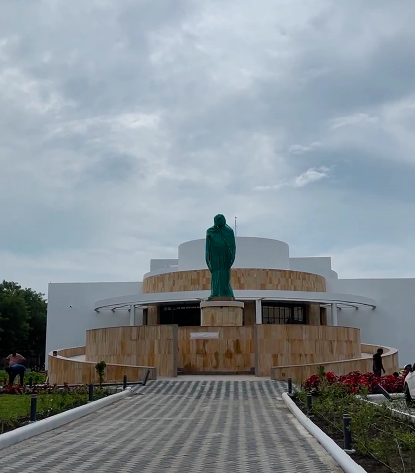
The digital experience belonged to a physical journey.
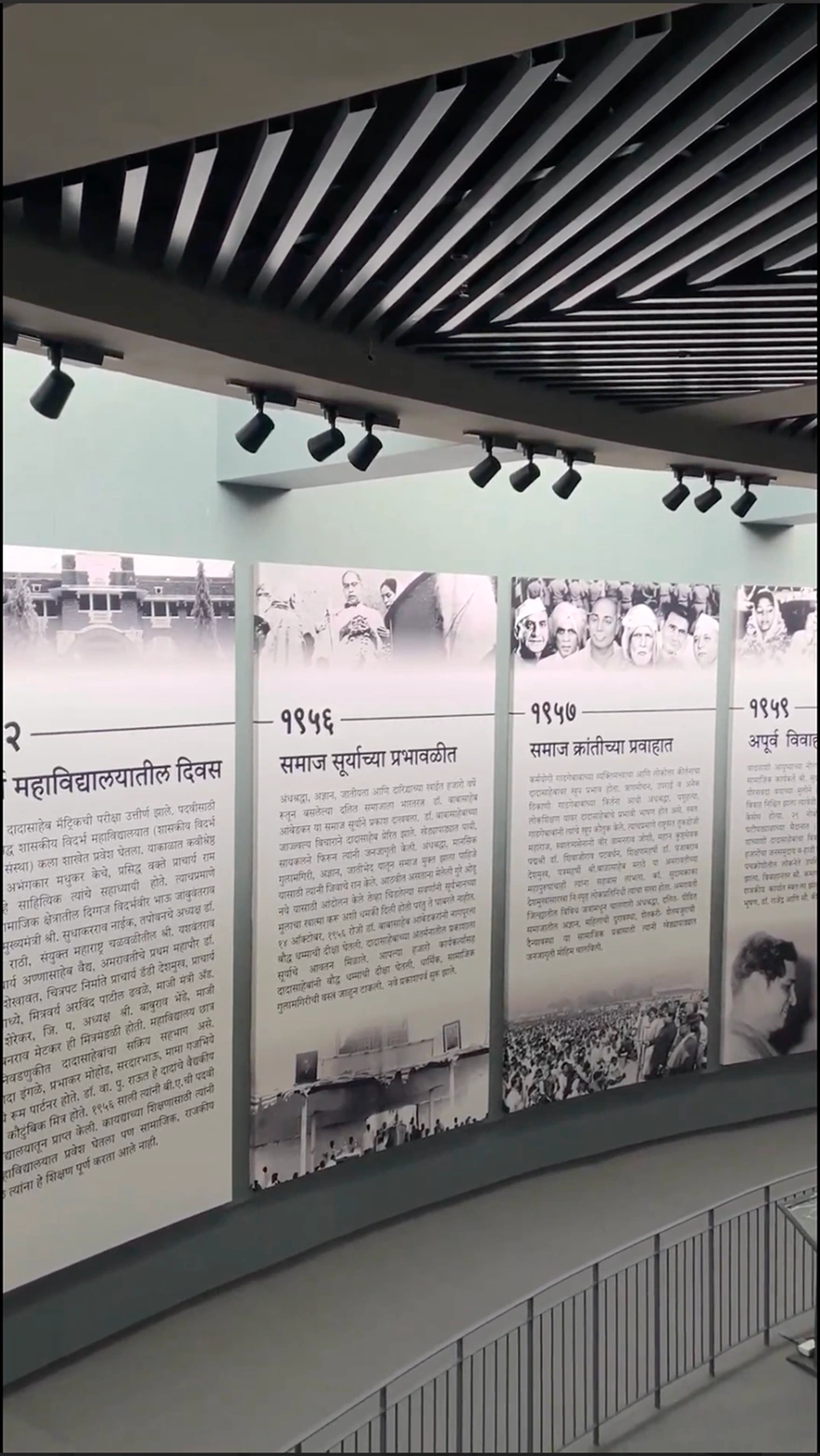
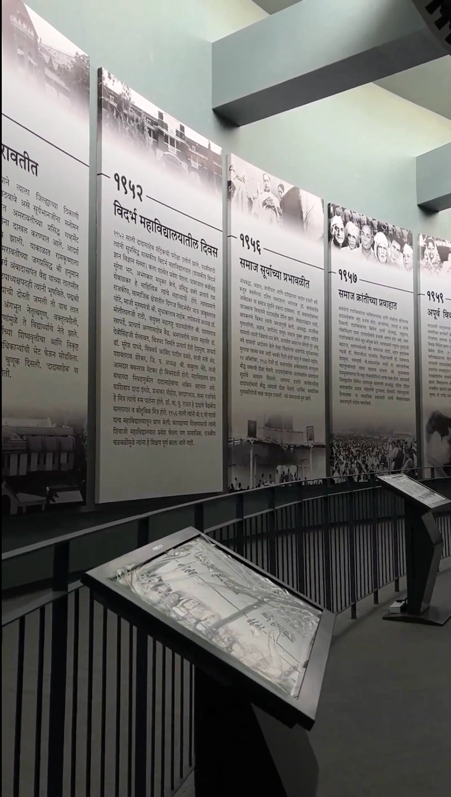
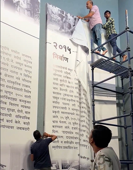
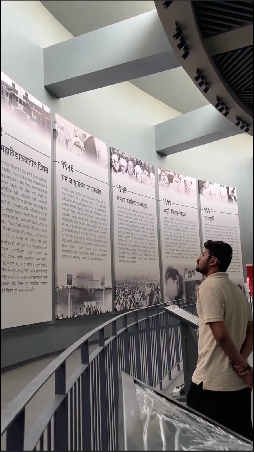
The exhibition paired eight kiosks with sixteen large vinyl wall panels. Each station introduced a phase of his life, with two corresponding parts on the wall. The kiosk journey and quiz changed at each station; Life Lessons, the avatar experience, and the overview video were shared across the eight kiosks.
That setting mattered: a visitor was encountering history in the exhibition, rather than sitting down to read an entire digital archive.
02
Problem and opportunity
The brief was open. The history could not be approximate.
The client’s initial request was broad: create a way for people to know and understand R.S. Gavai’s life. The team brainstormed the possible scope before a clear interactive journey took shape.
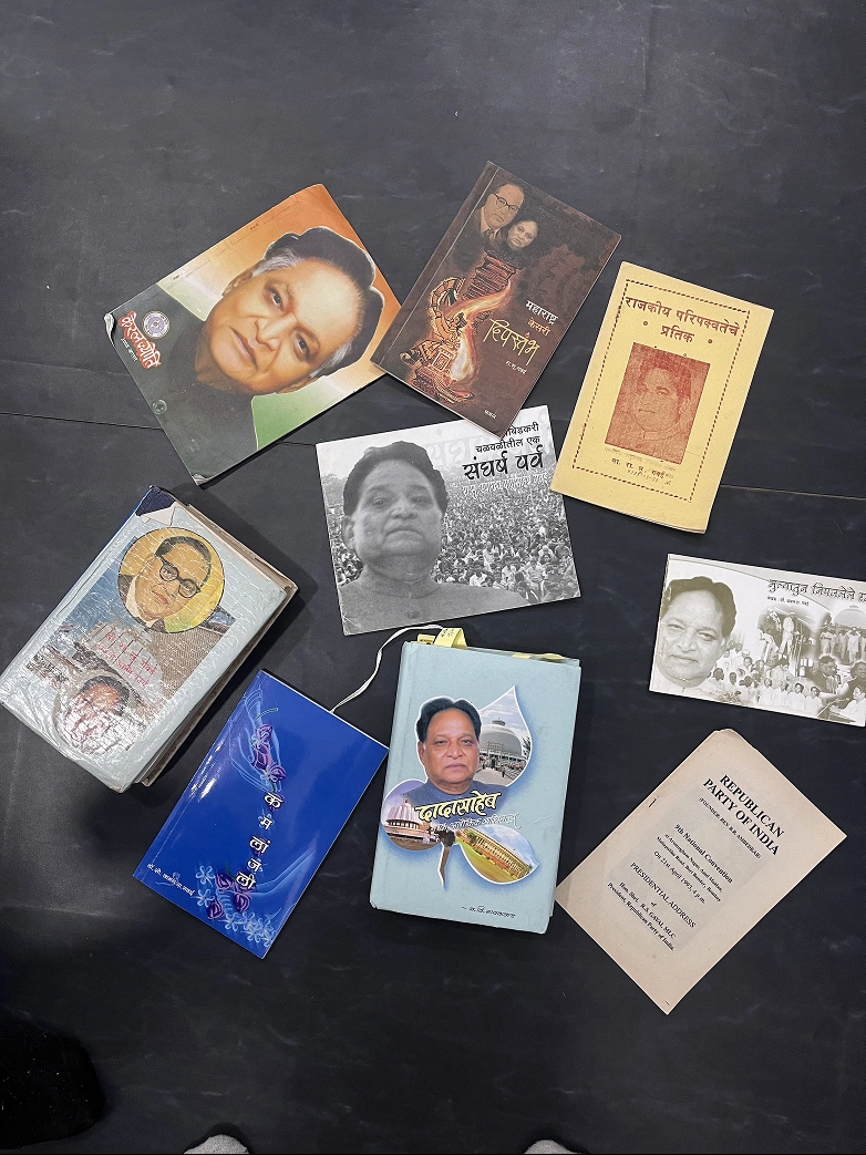
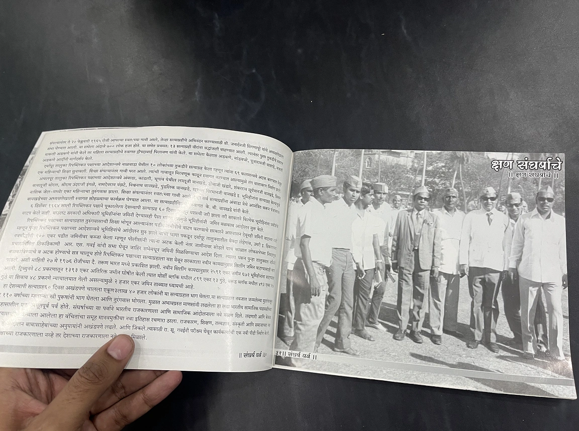
There was substantial material, including books written by him, his wife, and other writers. Bringing that information together was difficult. A screen full of historical detail could overwhelm visitors, but shortening it carelessly could change its meaning.
We worked with government school teachers who knew the source material and helped curate the narrative. Conversations with government officials and the Amravati PWD committee clarified stakeholder expectations. These conversations informed the brief; they were not a substitute for observing visitors.
A visitor needed an obvious first step.
Our design concern was that a public kiosk with too many competing options could feel intimidating. The opportunity was to provide a clear starting point, then let visitors choose how much further to explore.
The interface needed to hold two priorities together: make the history approachable and preserve its accuracy. Neither a crowded archive nor an oversimplified summary would serve the memorial’s purpose.
03
Goal
Make the life journey easy to begin and optional to deepen.
We organised the experience around a short phase-specific journey, with supporting activities for visitors who wanted to spend longer. Someone could read, listen in a familiar language, answer a quiz, or watch a brief overview.
In our own timed walkthroughs, the journey content at one station took roughly 40–50 seconds. Exploring all the available content thoroughly took around 5–7 minutes per kiosk. These are team walkthrough timings, rather than measured averages across visitors.
- Start clearly
- Give the life journey the strongest visual priority.
- Offer choice
- Support text, regional-language audio, quizzes, and video.
- Keep it usable
- Use readable text, contrast, larger touch targets, and accessible audio controls.
- Protect meaning
- Keep historical wording under review as the content becomes shorter.
04
Scope
My contribution within a shared effort.
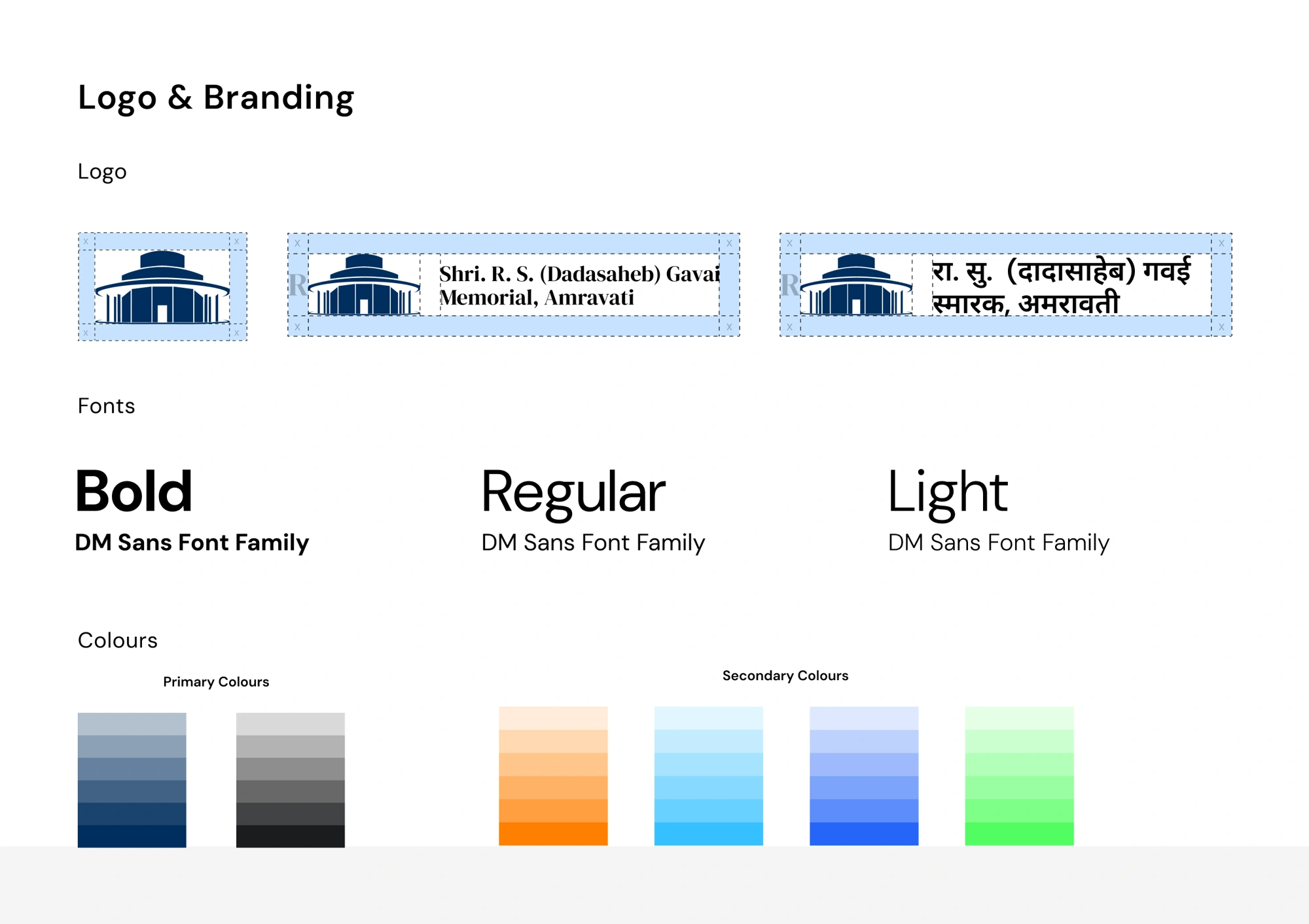
My work covered research, planning the information architecture and user flows, designing the interface, and handing it over to the developer. In a small studio, I also contributed across naming, the logo, and brand guidelines as the project developed.
Content authorship and historical approval remained with the client. Teachers helped curate the material, and we used AI to assist with shortening drafts. We iterated with the content contributors to preserve meaning and make passages manageable on screen. Government officials and the Collector reviewed the final text and design.
The delivery was a team effort. My UX lead guided design reviews, and the developer turned the designs into an offline software package for the 32-inch displays.
05
Explorations
The most novel feature was not the main task.
In an early layout, I gave the life journey and the AI avatar equal visual prominence. The avatar felt like a compelling feature, and I initially treated it as a central attraction.
My UX lead challenged that hierarchy. I realised that our interface should first help people understand R.S. Gavai’s life. The avatar could support that purpose without competing with the journey.
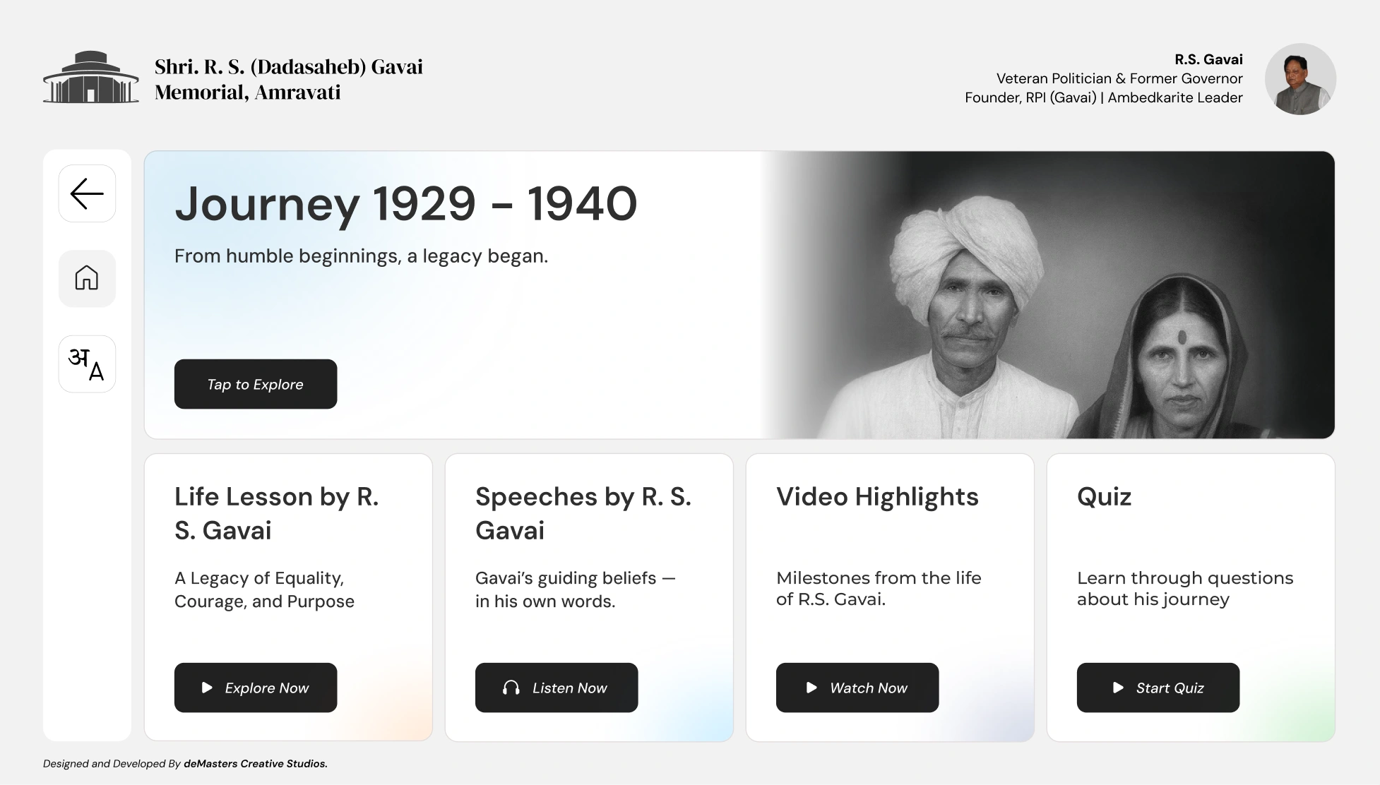
I revised the layout to prioritise the journey at the top, with four supporting panels below it. This became the key change in how the experience directed attention.
Shortening history required more than shorter sentences.
The team used AI-assisted drafts and teachers’ knowledge of the books to condense the material. The challenge was to retain its impact and meaning while reducing the amount visitors faced on each screen.
The final wording still needed official review. The design process therefore involved repeated coordination around content as well as screens: readability and historical accuracy had to progress together.
06
Solution
One clear route, with four ways to explore further.
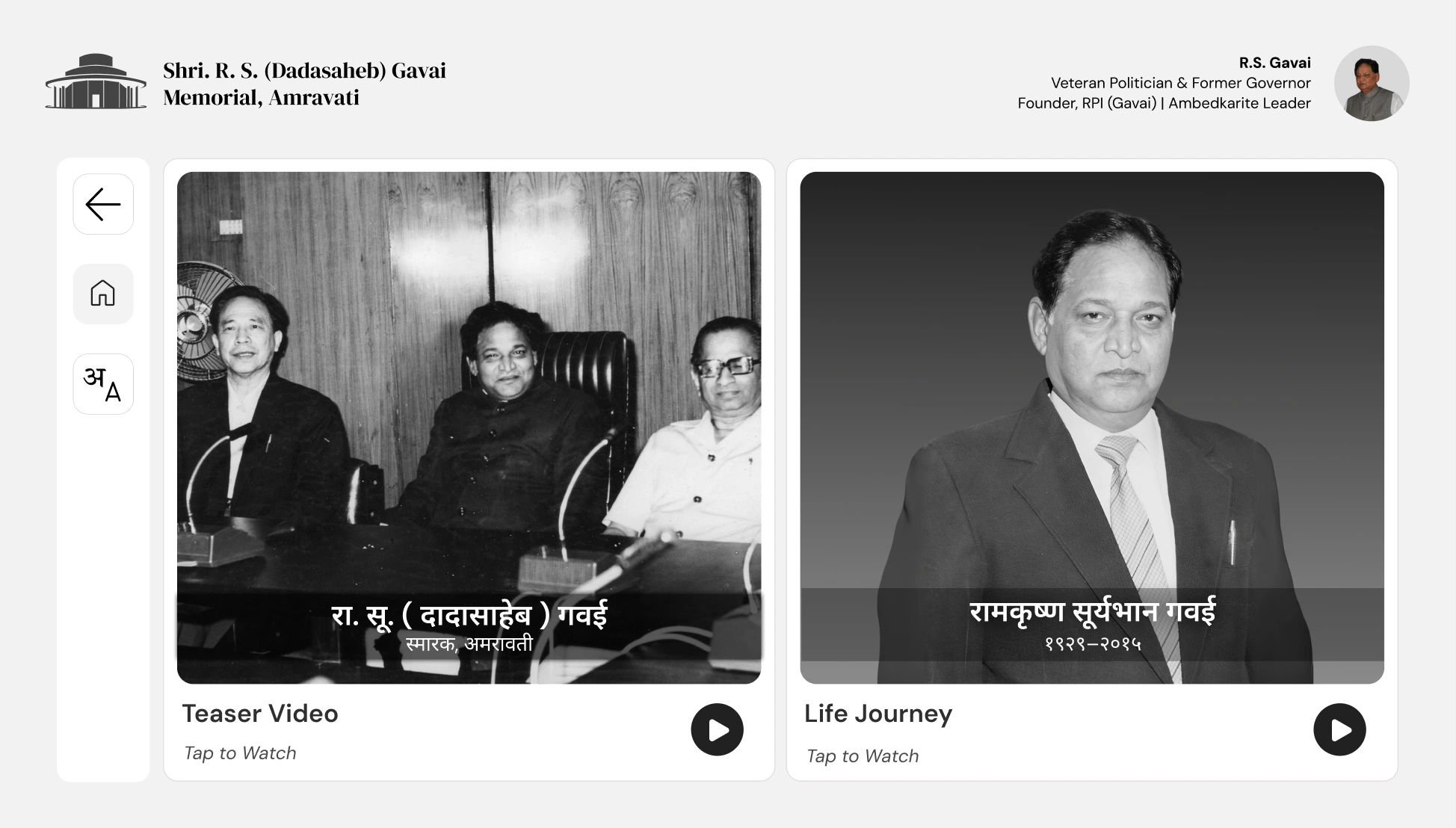
The dashboard presents five labelled panels. Journey comes first in the hierarchy. The remaining activities are available by choice, rather than forming a compulsory sequence.
| Activity | What it offers |
|---|---|
| Journey | The life phase associated with that kiosk, presented through short passages and audio. |
| Quiz | Questions connected to the phase at that station. |
| Life Lessons | Ideas drawn from different stages of his life. |
| Avatar | An AI recreation presenting curated speech material. |
| Video | An approximately two-minute overview for visitors who prefer watching. |
Reading was one way in. Listening was another.
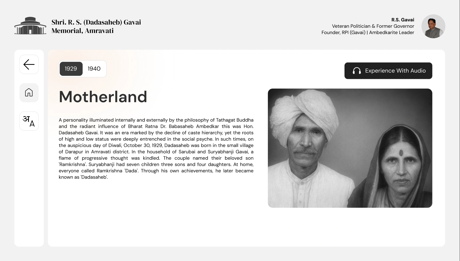
The journey combines historical photographs, concise text, and audio. For visitors who could not read the passages, the audio journey offered another way to access the story in their preferred language.
We worked on contrast, text size, colour, larger touch targets, and audio controls for the broad age range. Visitors could also change language midway through the experience.
Supporting activities kept the same subject in view.
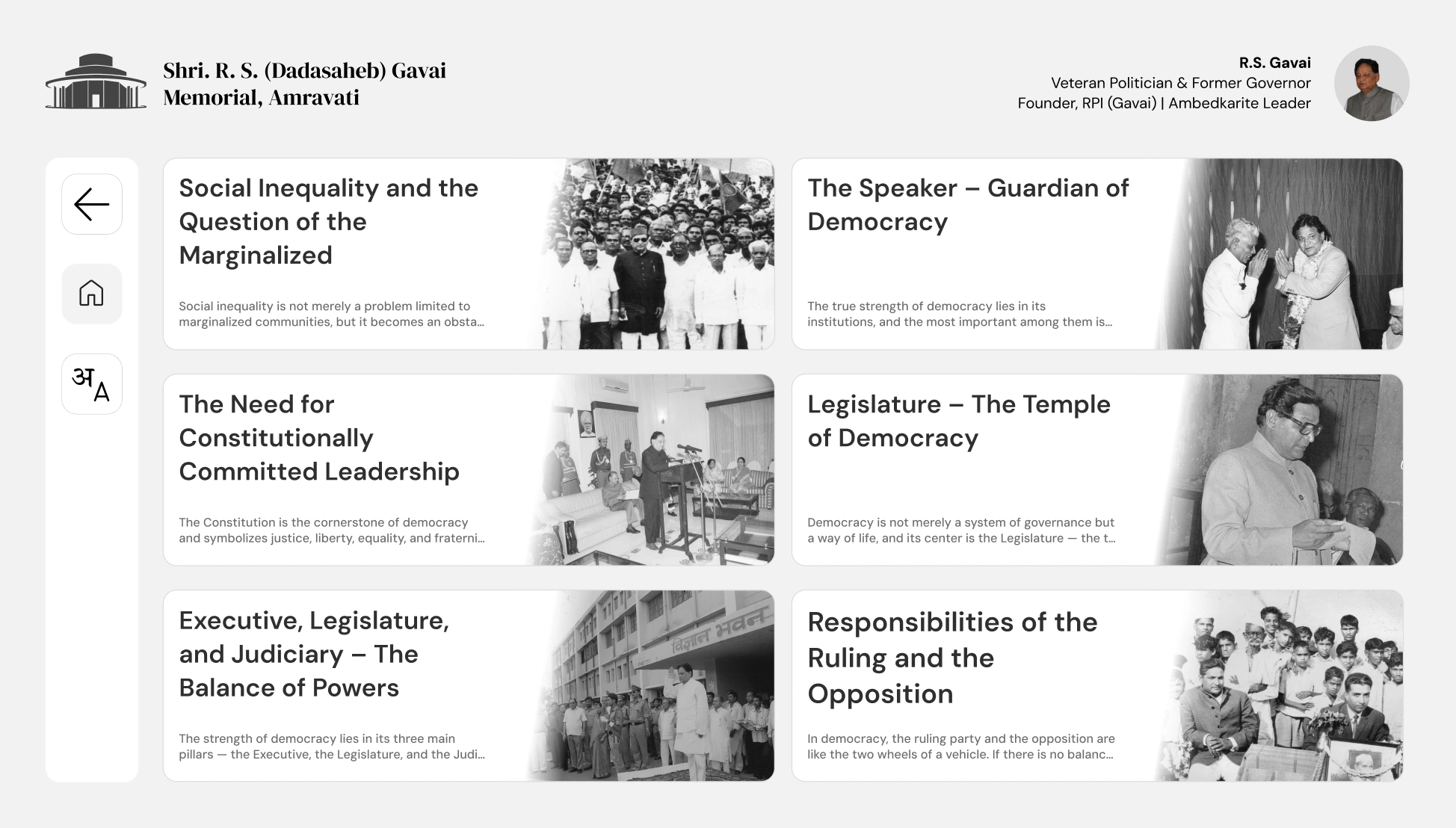
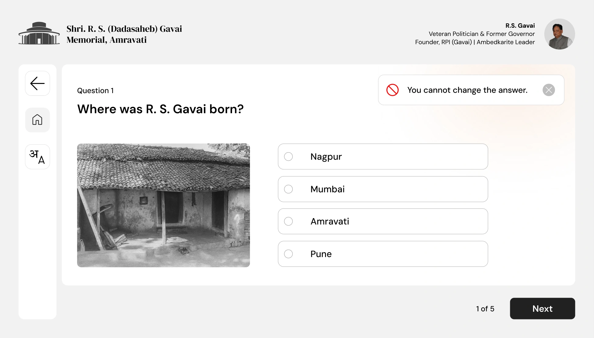
Life Lessons let visitors explore ideas beyond the timeline. The brief video provided another route through the material, while phase-specific quizzes encouraged visitors to revisit what they had encountered at that station.
The avatar needed careful review, too.
The team used HeyGen with historical photographs, videos, and speech material drawn from books to create the avatar and voice recreation. Early outputs did not match expectations, so the team iterated on the generated material.
R.S. Gavai’s wife and daughter reviewed the recreation. It was an AI-generated presentation of curated historical material, rather than an original archival recording.
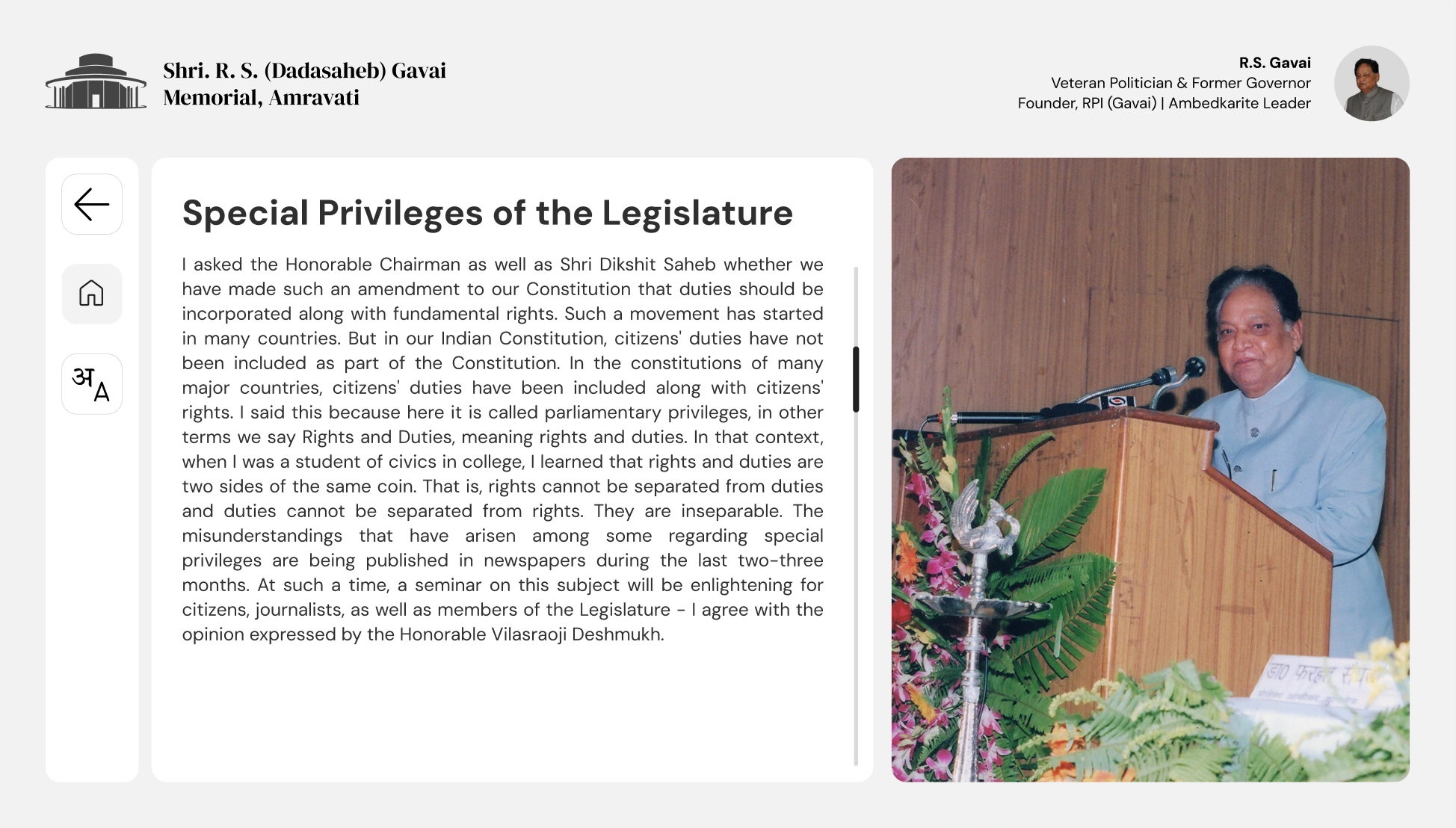
Designed for a shared, offline installation.
The software ran as an offline package, so the experience did not depend on an internet connection. If a visitor walked away, the kiosk returned to its starting journey page after one minute of inactivity.
The eight installations shared the same interaction structure while changing the journey and quiz content for each phase.
07
Conclusion
From an open brief to a launched memorial experience.
The kiosk experience was developed, handed over, installed, and launched with the memorial on 30 October 2025. Maharashtra Chief Minister Devendra Fadnavis and the then Chief Justice of India, B.R. Gavai, attended the inauguration.
During two days on site for installation and setup, we informally observed approximately 15–20 people using the kiosks. We saw visitors begin with the journey and explore supporting activities. This gave us a limited view of use in the exhibition, rather than a formal usability study.
The launch was an important delivery milestone. We did not measure changes in learning, comprehension, or engagement, so I do not treat the launch or positive reception as proof of those outcomes.
What I would carry into the next project.
This was my first large-scale government project. It taught me how much the quality of the final experience depends on keeping content, design revisions, approvals, and handoff organised. In a historical project, even a small wording mistake matters.
The hierarchy review also changed my judgment. I had given a novel feature too much prominence. Feedback helped me bring the interface back to the visitor’s reason for being there: understanding a life story.
For a future installation, I would plan more structured visitor evaluation beyond the setup period. I would check whether people can start independently, find audio and language controls, and understand the relationship between the wall panels and each kiosk.